


Tharik Mohamed Alikul Jaman
Design System: Why Your Company Needs One and How to Get Started
Every large-sized company has one design system. With every new release, they are updated and revamped with a new style. Companies like Airbnb, Uber, and IBM have incorporated design systems in their own unique ways for developing their digital products.
A design system is a complete set of standards intended to manage design at scale using reusable components and patterns. – NN group
You may be feeling the urge to create a design system for your organization. But do you need one?
To decide, let us look at a few things before considering a design system:
- Are you struggling with your design-development workflow?
- Are you making poor product decisions due to the handoff problem?
- Is it difficult to make design decisions for multiple products developed by distributed teams across different time zones?
- Are you experiencing issues with the delivery of the quality and consistency of your product?
If your answer to all the above questions is “Yes,” then you do need a design system.
Design system acts as a savior by bridging the gap between the designers and developers who work on multiple products recreating or duplicating components built by other teams. A design system aims to solve inconsistencies in a brand’s identity and user experience. That is why some of the biggest brands use design systems for more efficient design and better development process.
Building a Design System
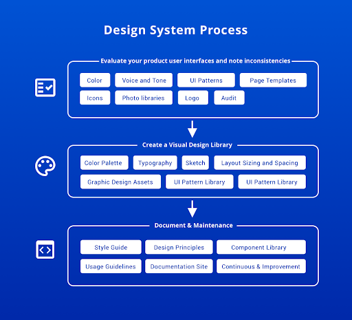
Evaluate your product user interfaces and point out inconsistencies
To begin with, do a visual audit of your products across different mediums such as an app, a website, or some other digital product. Review every digital asset and all existing reference materials.
The notes on inconsistencies will help in assessing how much time the process of building a design system would take. The goal of the evaluation is to assess:
- Color schemes and their usages
- Voice and Tone: Text choices, grammar selections, voice, etc.
- Icons
- Photo libraries
- Other graphics, such as logo
- UI patterns
- Page templates
To onboard your organization for creating the design system, the visual audit will give you leverage to help your team members understand why they need a design system. If you’re starting to build or plan new products, think critically about each aspect mentioned above to determine the best fit choices for your brand.
Creating a Visual Design Library
The core of the design system is to create the visual design parts of your product. Creating a design library will help you construct your digital product aligned with your brand. These form the core of every component on the product screen.
Color Palette
The color palette is a good place to kick-start the visual design. In the visual audit, you might notice the different shades of colors your product uses. Identify the commonly used colors, shades, and hues to create a color palette.
Pay attention to the colors used in the text, your links, special buttons, and the background.
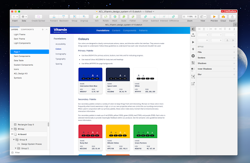
The color palette includes 1–3 primaries and secondaries to represent your brand. Include HEX, RGBA, or HSL codes in the documentation to help the developers.
Typography
Most design systems include two fonts: first font for both headings and body text, and a monospace font for writing code. Keep the font selection simple to avoid performance issues and confusing your user.
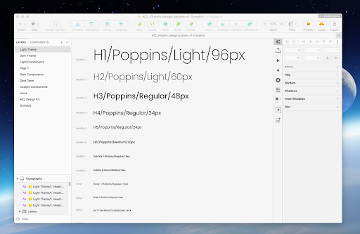
Create preferred text sizes, spaces, fonts, etc., and rules on where and when to use the fonts, for example, section headings in blog articles, calls-to-action font, and document technical details, like font weights, line heights, or custom kerning rules.
Layout Sizing and Spacing
Spacing and sizing in the UI layout makes the information easy to read, provides easy feedback and draws the reader attention to the necessary parts of the screen. Define the layout sizing and spacing to create the visual layout looks and balance for your product. The design system must capture all these information.
4-based scale is the recommended scale due to its use in material, iOS guidelines, and even the standard browser font size.
Graphic Design Assets
Collecting the graphic design assets will help you to fast-track the design workflow. Don’t forget to include the code snippets or any other documentation that developers may need. This inclusion helps during the development stage.
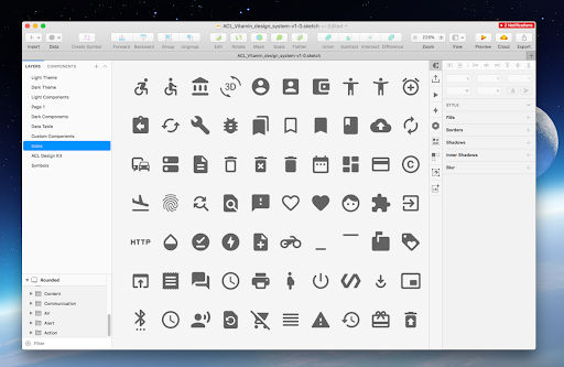
Graphic design assets for the design system include:
- Icons — Icons used across your products, apps, or sites
- Photography — Reference for photography, custom images, and purchased stock photos
- Illustrations — Compile all the custom illustrations into a single source
- Branding images — Compile standardized logos and other branding images, like mascots/avatars, ensuring compliance for the logo usage and other branding usages
You can include a list of design principles for everyone to follow when creating a new graphic asset. Capture brand styles such as image sizes, colors, compatibilities, and preferred file formats to keep these intact for the future.
UI Pattern Library
This step in the process helps you create the components of your UI. As part of the UI pattern library collect buttons, forms, modals, and even custom components.
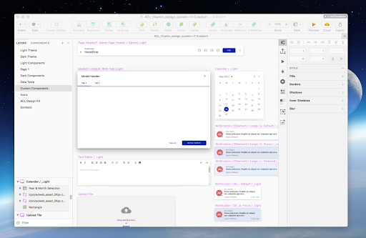
Creating a pattern library will help the designers and developers to use the design elements consistently across your site, app, or product. Be specific and more technical by including the usage notes to clarify how to use the component. Try to categorize UI components with functions like Navigation, Drop-down menus, Buttons, etc.
Documentation & Maintenance
After all the above steps, you need to create high-quality component documentation to build an effective design system. Describe each UI component precisely with styles, codes, and APIs to drive effective design decisions and speed development. To do so, it takes planning, effort, and process to come up with examples and guidelines. Begin documentation with the strategy of audience, content, and architecture of the design system.
Develop a plan to make a robust design system, establishing a clear governance strategy, and laying out a product roadmap.
Benefits of Design System
Brand recognition
Design system communicates a company’s value. It strengthens brand recognition and delivers the brand’s core values.
Improved communication and collaboration
Well-defined design principles and documented standards can help designers, developers, marketing specialists, and executives understand why and how to use the components and assets.
Enhanced speed and productivity
Design systems increase the speed and work productivity of design and development teams. You don’t have to reinvent the wheel every time, especially if the reusable components are tested and validated while creating.
Room for focus on solving user issues
Design systems help designers invest their time understanding and solving complex problems and exploring more possibilities in the product.
Better user experience
By utilizing a common design language, the product team is more likely to create a better user experience with consistent and proven patterns. Design system enhances brand recognition, team communication, work efficiency, better time allocation, and improved user experience.
Conclusion
To sum it up, design systems can help operationalize and optimize your design and development efforts. However, some of the main factors to consider while creating a design system are,
- Scalability and replicability of components
- Time and resources availability
Poorly implemented and maintained design systems can become unwieldy collection of components and codes. But, when properly implemented, they can educate team members, streamline process, and enable designers to tackle complex UX problems. Get in touch with us to learn how ACL Digital can help you stay on track with your business goals.


